Documentation users rely on headings to quickly locate content of interest, so they should be easily identifiable and provide meaningful context/keywords in a consistent way. Within these golden rules, though, there’s ample room for customisation to reinforce a particular document/provider’s brand. Continue reading “Writing and Formatting Headings”
Tag: Font
Cyrillic characters in LaTeX
This one caused some headaches here, so recording the solution in case it’s useful to anyone else.
I wanted to include a Cyrillic string (copied and pasted from an email) in a LaTeX document whose default fonts didn’t support Cyrillic, but when I saved and compiled the file it was replaced by a string of question marks instead. After much poking around and experimentation, and with some assistance from Dave who is even more proficient in LaTeX than I, this solved it:
- First off, make sure you’re saving your document in UTF-8. (In WinEdt, this is set under Document > Document Settings… > Format.)
- In the document preamble, define the font family for cyrillicfont to one that matches your main package’s font (or that is close enough, but supports Cyrillic):
\usepackage[utf8]{inputenc}

\usepackage[T2A,T1]{fontenc}

\usepackage{polyglossia}

\setdefaultlanguage{english}

\setotherlanguages{russian}

\newfontfamily{\cyrillicfont}{Times New Roman} - In the document body, add your Cyrillic content in the second pair of curly brackets of:
\foreignlanguage{russian}{}
Do not spellcheck!
Generally speaking, you should spellcheck everything you write. Word has some fairly decent in-built spelling and grammar checking, and while it may not get everything, it’ll catch a lot. However, on occasion, there’s content you really don’t want to spellcheck. Case in point: API/developer documentation rife with code samples: yes, I did mean to spell it that way; yes, it is all one word; no, I don’t want to capitalise that just because it’s at the start of a line; no, I don’t want a space after that semi-colon… And by the time you’ve hit Ignore for the umpteenth time in a row, you realise you’re back in body text, and you’re not sure how long you’ve been on auto-pilot clicking Ignore, and who knows what garbage you’ve said is ok to leave as is now, and you may as well go right back to page 1 and start over. So what do you do? Forego spellchecking entirely? Copy and paste the non-code-sample bits to a separate doc, spellcheck, then merge back in? Or magically tag the code samples as not to be spellchecked and live happily ever after? It’s a leading question, I admit it. The last option it is, and today’s post is on how to do just that! Continue reading “Do not spellcheck!”
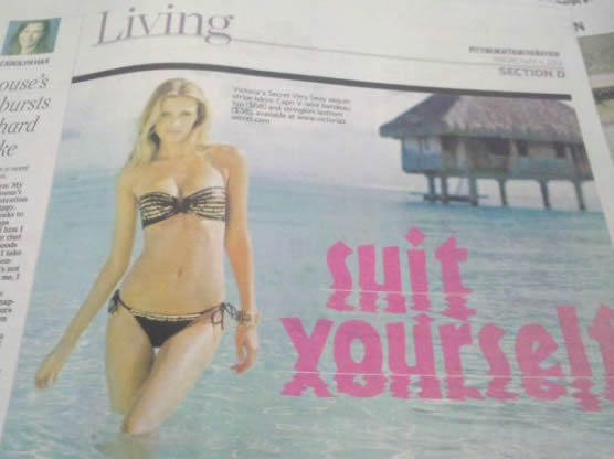
Bad Design Choices – #1
I posted a few illustrations of unfortunate font choice a while back. Here’s an example of a poor choice of special effect applied to an otherwise perfectly reasonable font. Don’t get carried away with those fun filters, kids! Or just suit yourself. 😉
Bad Font Choices – #1
I’ve seen a few entertaining images floating around on FB and Twitter recently illustrating the consequences of a poor choice of font, so decided to assemble a few of them here.