Style Overrides in FrameMaker

One of the reasons I prefer FrameMaker over Word, is that it doesn’t automagically update your paragraph styles as you work. Word has a tendency to either add new items to the list when you make a tweak (Normal, Normal but Bold, Normal but Italic, Normal but 12pt and blue…), or to modify an existing style to match your one-off customization, and all of a sudden a paragraph two chapters back is mysteriously rendering in 14pt instead of 10 and when you fix it that extra-large warning note you were working on earlier has gone back to 10pt “all by itself”. There are settings buried in the software to determine what exactly happens when you modify a style, and where the change propagates to, but Word works in mysterious ways, and I just don’t have the time or energy to figure it all out.

I favour the simple elegance of how FrameMaker does things:

  • FrameMaker Status Bar showing Paragraph and Character StylesThe paragraph and character styles for the selected text are shown in FrameMaker’s status bar.
  • FrameMaker Status Bar showing Modified Paragraph StyleIf there’s a manual override to a paragraph style (for example, a change of font), an asterisk appears beside the style name in FrameMaker’s status bar.

If there is a manual override, you can check what the original definition is in the Paragraph Designer, and decide whether the override is justified or not.

If an override is justified:

  • For a genuine one-off situation, you might want to just leave the override in place. Bear in mind, that if you reimport styles and say to remove overrides, you’ll lose the modification at that point.
  • For a recurring situation, you might want to create a new style. For example, if you want the first paragraph of every section to be blue and italic to designate it as introductory material, that’s worth a new style. (Click Commands | New Format in the Paragraph Designer.)
  • If you decide the override is one you’d like to see everywhere this paragraph style is used, then you’ll want to update the existing style to match the modified version. (Click Update All in the Paragraph Designer.)
  • And finally, if you decide the override is invalid, you should just re-apply the correct style instead and move on. (Click Reset in the Paragraph Designer.)

Simple and elegant. Me likey.

SkyDrive

SkyDrive is a cloud storage solution from Microsoft. It allows you to store content “in the cloud” and retrieve it through a web browser. They also provide free apps to allow access from Windows and Mac machines, Windows Phone and iThings. Anyone can sign up, for free, and at the time of writing, you get 25Gb of storage free with a basic account. Not to be sneezed at. You can add more storage (20-100Gb) for an annual fee (€8-€37).

There are a few nice features:

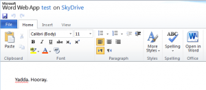
  • Web Interface for Word on SkyDriveYou can create and edit Word, Excel, PowerPoint and OneNote files through the web interface. You won’t get all the functionality of the desktop versions of the software, but the essentials are there.
  • You can share uploaded content (individual files, or whole folders) with specific individuals by issuing invitations. They’ll only see the specific content you’ve chosen to share with them once they log on. I find this handy for sharing large documentation deliverables, too large for mail server limits, with clients.
  • If you install a desktop app on your PC or Mac, your SkyDrive will show up as a virtual drive on your local machine, and you can view and edit local copies of your content. Changes are synced back to the cloud. If your internet connection disappears, you might not notice, though, so for anything critical, it’s no harm to check your changes are in the cloud copy of the file before you shut down your machine and leave.
  • Even better, you can access your PC or Mac remotely to pick up any files you forgot to upload to the SkyDrive. For this to work, your will need to be on, the SkyDrive app installed, and you’ll need to authenticate with a code mailed to the email address your SkyDrive is associated to.
  • You can disconnect an authorised machine at any time via the web interface, so if your laptop is nicked, or you change jobs, you can break the link remotely.

Not bad at all for a free service.

I Shot the Serif

iThing logo for I Shot the Serif@DaveGorman gave this a mention on twitter a couple of days ago, and I had to give it a try.

Available for free as a web app and for iThings, I Shot the Serif is a fun way to squander a few idle moments. And you can tell yourself that you’re developing useful proof reading skills while you’re at it.

Basically, you’re presented with a grid of random letters, half of which are in serif fonts and half in sans-serif. You have to select (shoot) the serifs, and leave the sans-serifs alone. You’re playing against a timer, and are allowed a certain number of mistakes. The higher the level you play at, the less time you have, and the fewer mistakes that are allowed.

"I Shot the Serif" screenshotThe 5yo (still high on his zombie shooting buzz from last week) was keen to have a go when he saw me playing, and I was impressed by how well he did. I’m kidding myself that it’s helping him improve his reading skills (he does whisper the names of the letters to himself as he inspects each one), but really I know he just likes the sound effects.

Downsides: I found that on the iPhone this crashed very frequently, often when I was on my way to a highscore. And the shooting sound effects were a bit much for me, so I played with the volume off. Aside from those 2 niggles, it’s great fun.